 กำลังเปิดฉาก…




Speak Now · Between the Lines
the Branding of



















home
|
Back
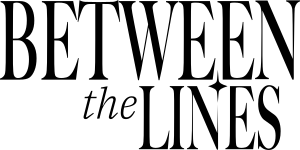

The Star Symbol and Between the lines wordmarks
Download
Logo variations
stacked
Horizontal
150 px
100 px
300 px
500 px
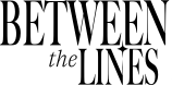
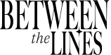
Stacked Format The Stacked format is the Primary Brand Mark. It is designed for cross-platform deployment across core digital media, websites, corporate presentations, and official announcements. This structure is precisely calculated for maximum prominence in standard spatial applications, serving as the initial visual anchor driving the brand's future trajectory.
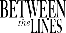
Horizontal Format The Horizontal format functions as the Secondary Brand Mark, scaled to accommodate restricted vertical spacing. This horizontal configuration is optimal for copyright footers, print media with strict height limitations, and co-branding applications alongside partner logos to maintain absolute visual equilibrium.


The Star Symbol
stacked wordmark
Horizontal wordmark
The Star Symbol serves as the primary Graphic Element. It is not intended to replace the primary logo for brand naming but is deployed to reinforce the Visual Identity. It acts as a directional visual tool reflecting visionary and forward-thinking principles within decorative contexts.
The Stacked Wordmark mandates strict placement rules that must be rigorously adhered to, preserving design weight and instant brand recognition upon first glance. This stacked format is strictly restricted to the Top-Left or Top-Right corners of the media layout. Central or bottom placement is strictly prohibited.
Horizontal Wordmark Placement The Horizontal Wordmark dictates usage contrary to the stacked format, being strictly mandated for the Bottom section of the media layout only. Positioning the horizontal format at the bottom establishes a stable visual foundation, prevents interference with primary content areas, and systematically organizes the brand structure to accommodate the scalability of all media types.
Clearspace





The logo may be overlaid on photographic or graphic backgrounds with the strict caveat that the Star Symbol and entire wordmark must maintain absolute legibility and visual contrast. Furthermore, any background imagery utilized must be of high resolution. The deployment of the logo over pixelated, degraded, or low-quality imagery is strictly prohibited to uphold the brand's premium standard and forward-thinking aesthetic.
in context
Special-Use Wordmarks to Represent each eras of Taylor swift
Logos may be color-adapted to represent Taylor Swift's 12 eras, integrating the brand with the exhibition. Strict adherence to the provided color values is mandatory. Unauthorized modifications are strictly prohibited to maintain systematic brand consistency.
Self-Titled
Fearless
Speak Now
Red




1989
reputation
Lover
folklore
evermore
Midnights
THE TORTURED POETS DEPARTMENT
The Life of a Showgirl
Dynamic coloring
solid coloring
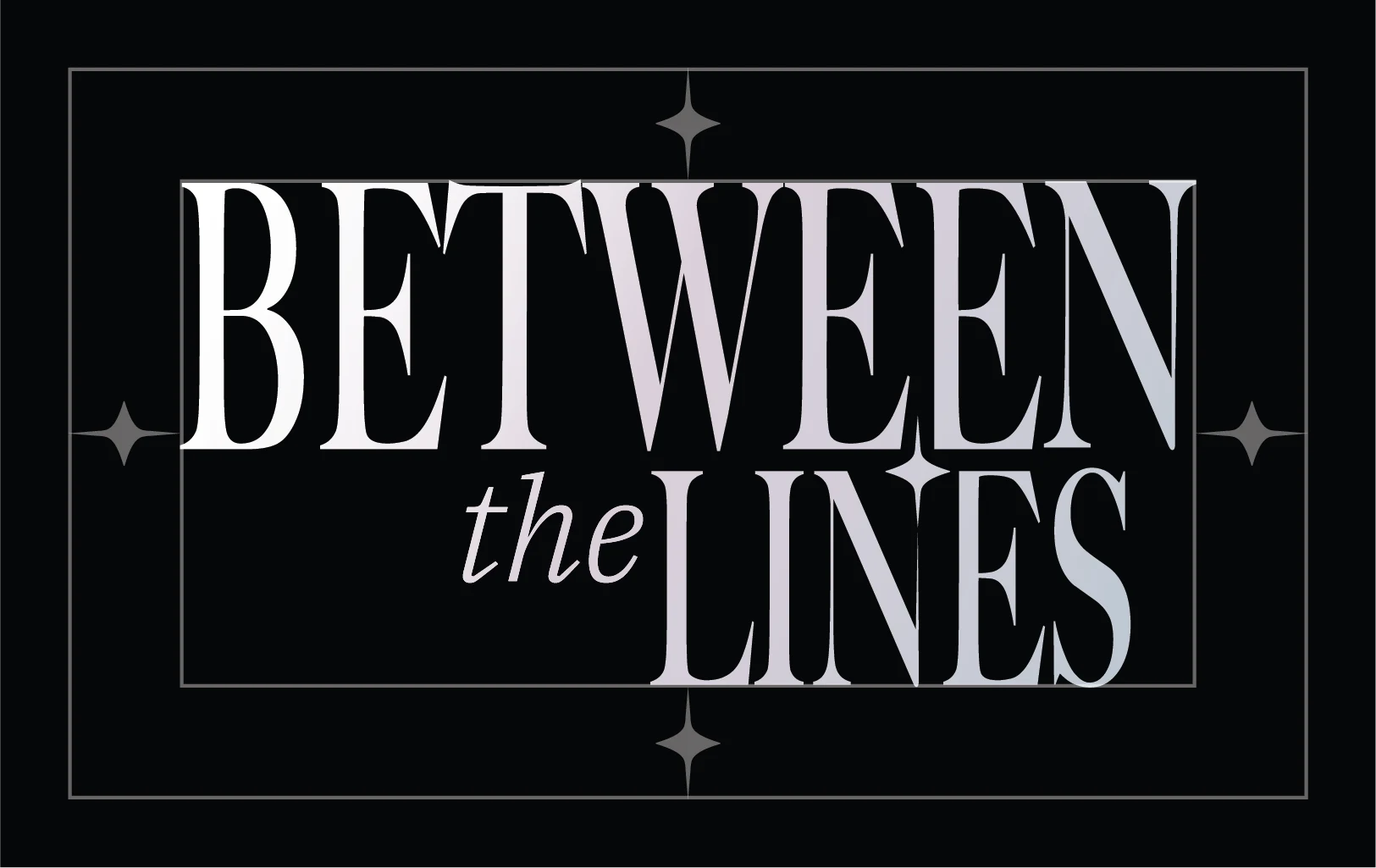
Iridescent white
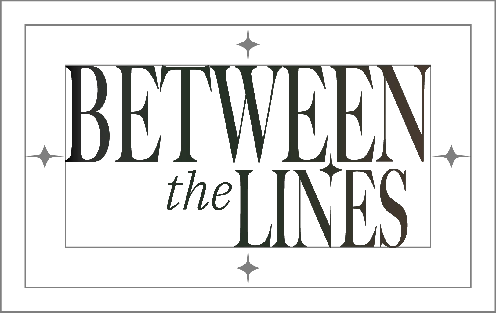
Iridescent ink
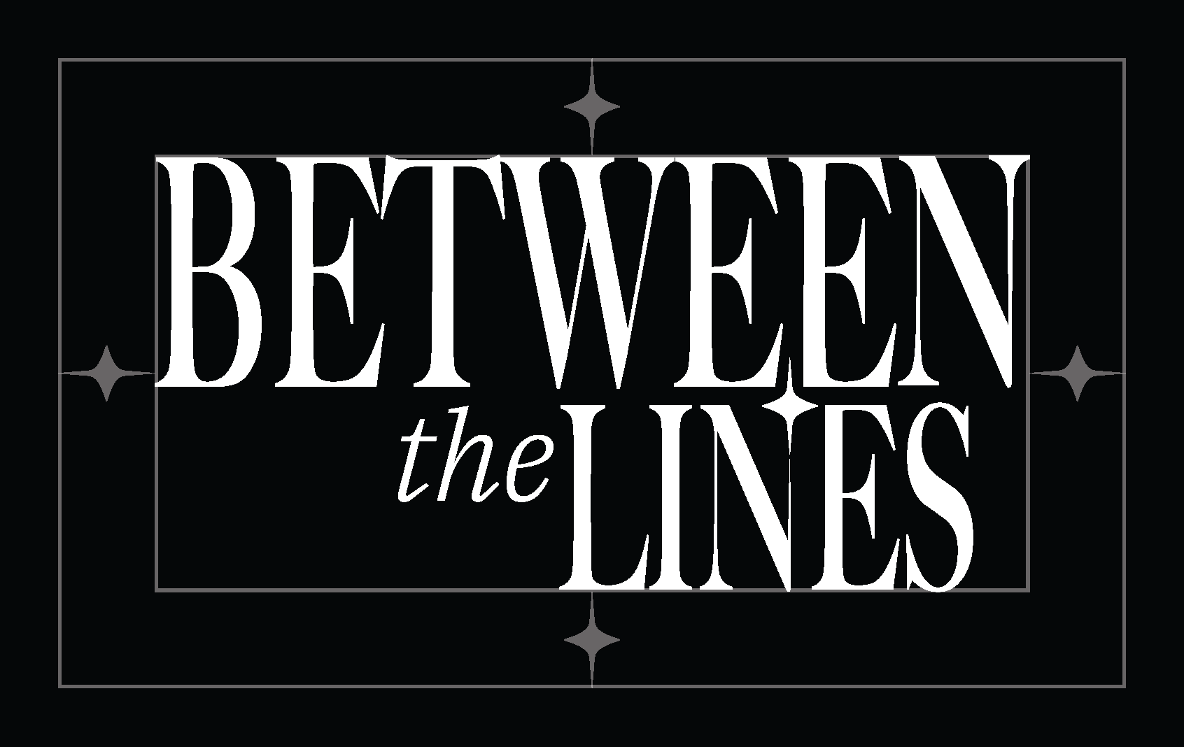
Blank Canvas
Author’s Ink






A bright logo with dimensional lighting effects, intended for use on dark gradient backgrounds to reflect the discovery of meaning hidden between the lines.
The standard opaque format, intended for use on solid dark backgrounds to maximize contrast.
The standard opaque format, intended for use on plain, light-colored backgrounds.
color
The palette features two core themes: 'Iridescent Starlight' for fluid, visionary brightness, and 'Author's Ink' for deep, formal gravity. Strict adherence to these designated swatches is mandatory to preserve brand uniformity across all touchpoints.
Iridescent starlight
Download Swatches
Things to avoid






Don't stretch
Don't add effects
Don't use busy backgrounds
Don't change the color
Don't rotate
Don't copy logo style
Don't changed “the star”
Don't enclose
Don't use text as a logo
Don't flip
APPLICATION EXAMPLES
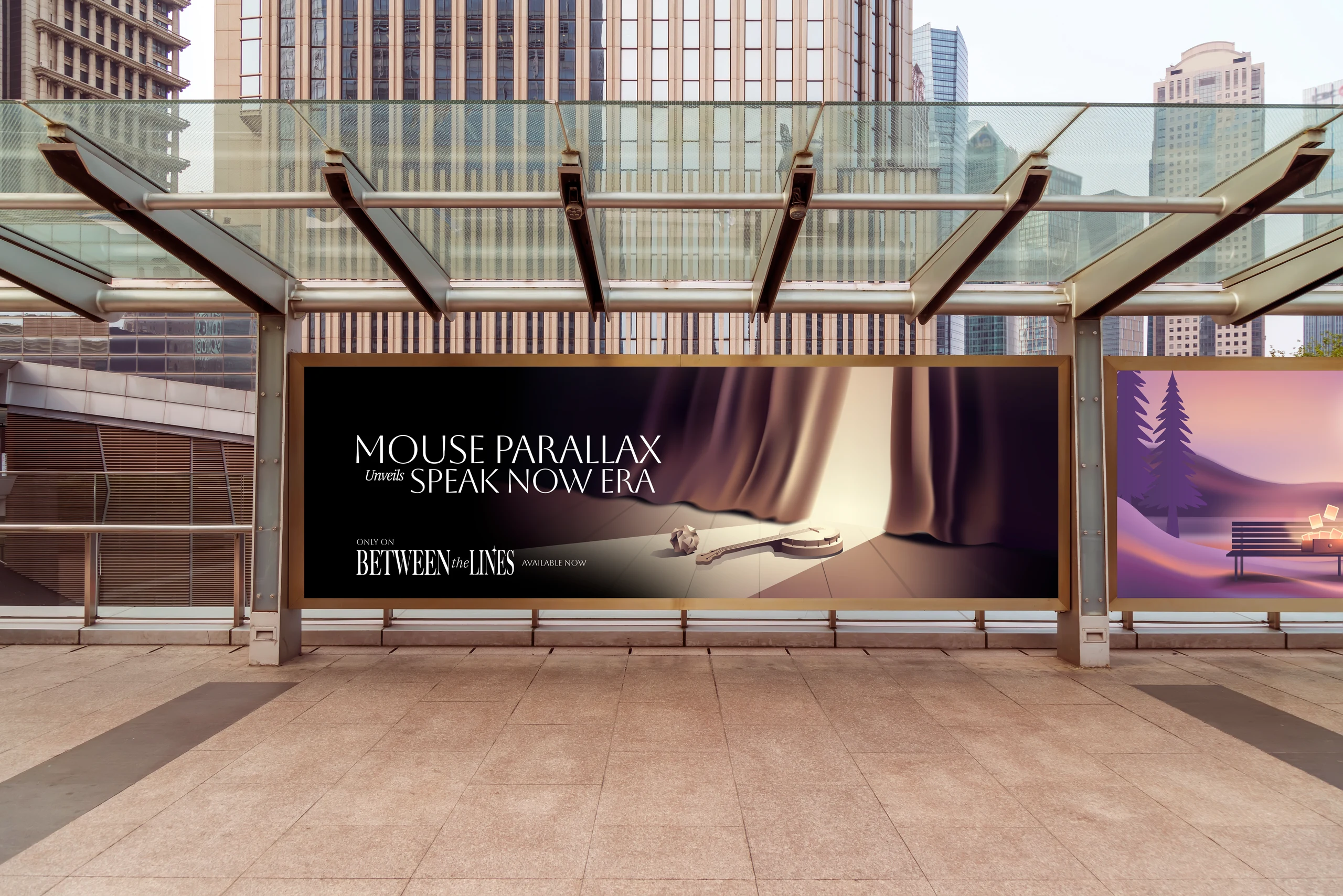
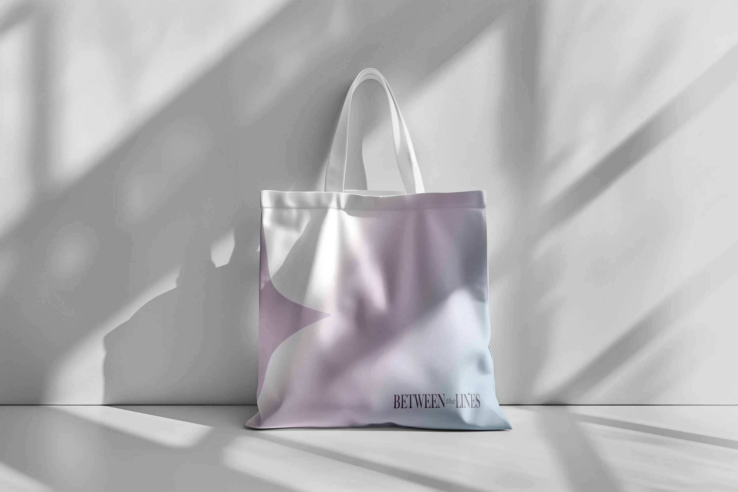
The identity system is engineered for flawless scalability. It maintains absolute prominence and strict legibility standards across all environments, adapting seamlessly from digital touchpoints to physical Out-Of-Home (OOH) billboards.
Typography


headline
Aboreto
a b c d e f g h i j k l m n o p q r s t u v w x y z
body text
IBM Plex Sans Thai
ก ข ฃ ค ฅ ฆ ง จ ฉ ช ซ ฌ ญ ฎ ฏ ฐ ฑ ฒ ณ ด ต ถ ท ธ น บ ป ผ ฝ พ ฟ ภ ม ย ร ล ว ศ ษ ส ห ฬ อ ฮ
IBM Plex Serif - Italic
a b c d e f g h i j k l m n o p q r s t u v w x y z
Co-branding principles
The secondary brand mark, optimized for restricted vertical spacing. Deploy this horizontal format for copyright footers, print media with strict height limitations, and co-branding applications alongside partner logos.
the star + Partner Logo


The Star + Partner Logo: The Star symbol may be paired with partner logos utilizing approved separators: a vertical line, an ampersand (&), or measured clear space.
Between the lines wordmark + Partner Logo
Wordmark + Partner Logo: The Stacked Wordmark is the only permitted format for partner pairings. The use of the Horizontal Wordmark in co-branding applications is strictly prohibited. This mandate preserves structural equilibrium and brand weight.



MARKETING PARTNERSHIP END CARDS
partner
+
only on
AVAILABLE now
Marketing Partnership Lockup

Original Writing Symbol
The "From the Desk Of" symbol is exclusively reserved to authenticate original writings authored by PONGPOND KARNSUBWEDCHKIJ. Unauthorized usage, reproduction, or modification by any external party is strictly prohibited. To request formal authorization for usage or reference, contact must be made directly via email at: betweenthelines@saratay.com.
ผลงานต้นฉบับ | จากโต๊ะทำงานของ
pongpond karnsubwedchkij
Product Messaging
Message lengths are strictly categorized for adaptive deployment across varying media constraints:
Long: Experience the definitive digital music exhibition. Decode the intricate narratives, hidden meanings, and iconic eras of Taylor Swift through an immersive, architectural lens exclusively on Between the Lines. Medium: Decode the architectural narratives and hidden meanings of Taylor Swift's iconic eras on Between the Lines. Short: The ultimate Taylor Swift digital exhibition. Only on Between the Lines.
Copy Style & Capitalization
To ensure absolute brand uniformity, typographic structures must adhere to the following mandates:




Brand Naming: "Between the Lines" must always capitalize the B and L, with a lowercase t. The abbreviation "BTL" is prohibited in primary communications. Avoid possessive forms (e.g., Between the Lines's). Title Case: Enforced for Era titles, primary headings, and track names (e.g., The Tortured Poets Department, Sparks Fly). Sentence case: Enforced for body copy, narrative analysis, and legal language. ALL CAPS: Exclusively reserved for Call-to-Action (CTA) buttons and primary navigation (e.g., CONTINUE EXPLORING). all lowercase: Enforced for URLs and metadata tags.
Between the Lines Between the Lines | From the Desk of PONGPOND KARNSUBWEDCHKIJ BetweenTheLines.com (for optimal readability in body text) @betweenthelines #BetweenTheLines
BETWEEN THE LINES Between The Lines BETWEENTHELINES betweenthelines.com (outside of direct hyperlink contexts) @BETWEENTHELINES
